Stayawhile
I was the Lead Product Designer at Stayawhile. Stayawhile's mission was to create a branded network of furnished apartments for stays of a month or more. After passing an initial background check, users would have full access to all of our units and can book them with no concerns about safety or paperwork. All Stayawhile units would be furnished to our brand standards and would come with all the utilities you'd need including wifi, cable, a fully-stocked kitchen, bathroom amenities, and much more. When I joined, there was no app in place and zero apartments in our portfolio. In two months I had wireframed, designed, branded, and coded the front-end for the entire first-version of the application.

With hundreds of wireframes produced in a short amount of time, countless edits to our brand direction and developing the CSS UI library for the entire site, our MVP was ready. The apartment team also had their hands full in leasing, furnishing, and setting up utilities in several apartments in the span of a couple months.
After initial feedback from customers, we decided to pivot our brand direction—emphasizing a more colorful, younger aesthetic with heavy usage of vector illustration.

Most pages on the site are static, with the exception of the user dashboard and locations/listings pages which were dynamically populated using a Python framework called Flask.
The user dashboard has multiple states:
- New Member: The user has signed up with their email or Facebook/Google account but has yet to pass the background check.
- Full Member: The user has successfully passed the background check and can sign up to any available units in our network.
- Rejected: The user has not passed the background check, due to a discrepancy or criminality found in the check.
The dashboard for full members also comes with multiple states:
- Empty Dashboard: The user has yet to book any units.
- Upcoming Booking: The user has booked a unit at an upcoming date. Users can modify or cancel this reservation.
- Active Booking: At the date of your upcoming booking, the dashboard UI will reflect this as an active booking, with users able to lengthen their stay. They will not be able to shorten or cancel at this point.
- Previous Bookings: A list of previous units the user has stayed in, with invoice details.

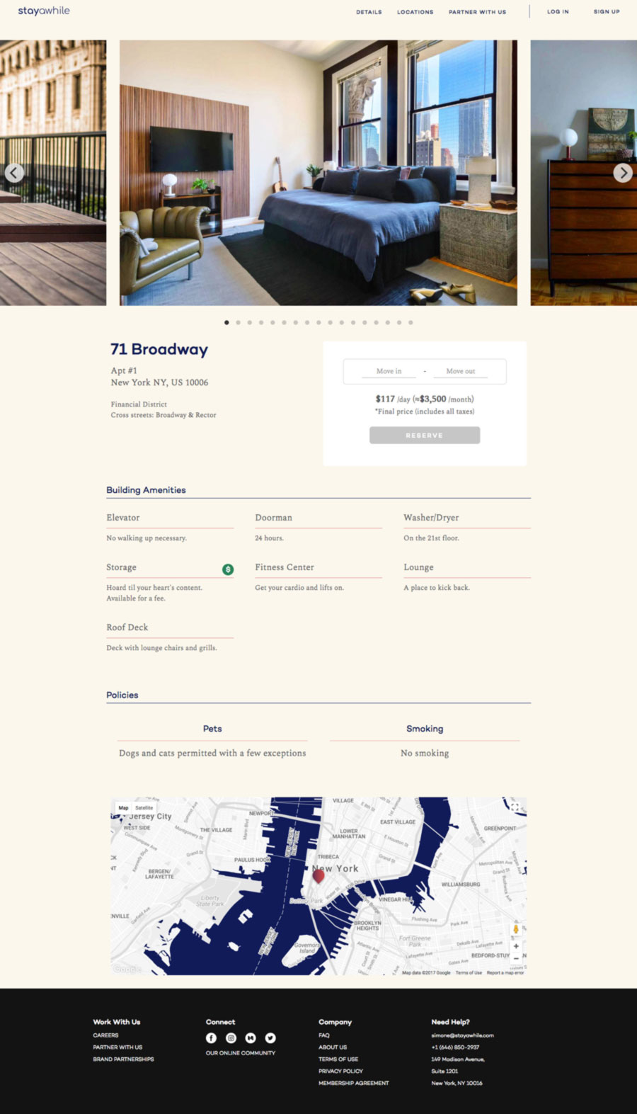
The Locations page is arguably the most complex page on the site. This is where users would most likely spend the majority of their time. Since we wanted to encourage users to look at the apartments we offer as a network, units from every city we're located—NYC, Boston and Philadelphia—can be viewed at once from this page.
In order to show multiple cities within the same aresults view, I coded a 'sticky' interaction where the city map follows the units all the way to the bottom of its container.
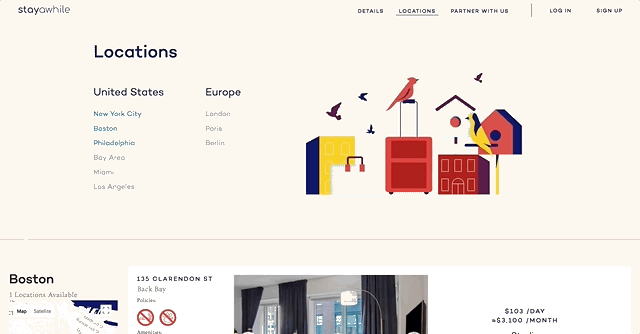
I designed a unique set of symbols to represent unique amenities and policies found in the apartment building.
Since we frequently have multiple units within the same building, I designed a nested display where the full cell represents a building with its own metadata and the individual apartment units are nested inside with its corresponding information. The building address, neighborhood, amenities, and policies are also 'sticky', following the user scrolling down the page until it reaches the end of its container.

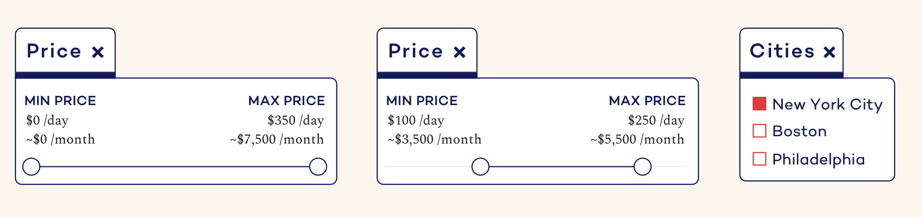
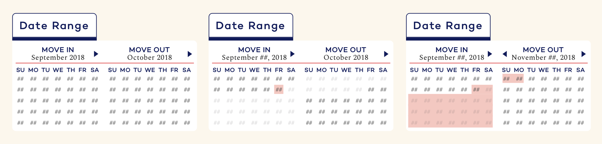
Since this is a single page with almost thirty apartments, filtering is essential to the user experience. I designed a set of filters for the following parameters:
- Date
- City
- Price
- Amenities
- Policies
The amenities selection is a series of customized checkboxes, where the icon itself is the checkbox. Policies were built as radio buttons since—for example—a filtered unit cannot be simulataneously smoking and non-smoking.
Once your filters were selected, I wanted users to be able to tell for the most part what they had selected without needing to open up the filter again. For the dates and price, a simple text change would suffice. For amenities and policies, I inserted up to two of the selected icons into the button itself. Any number of selected items larger than two would be replaced by the number representing the amount selected there.
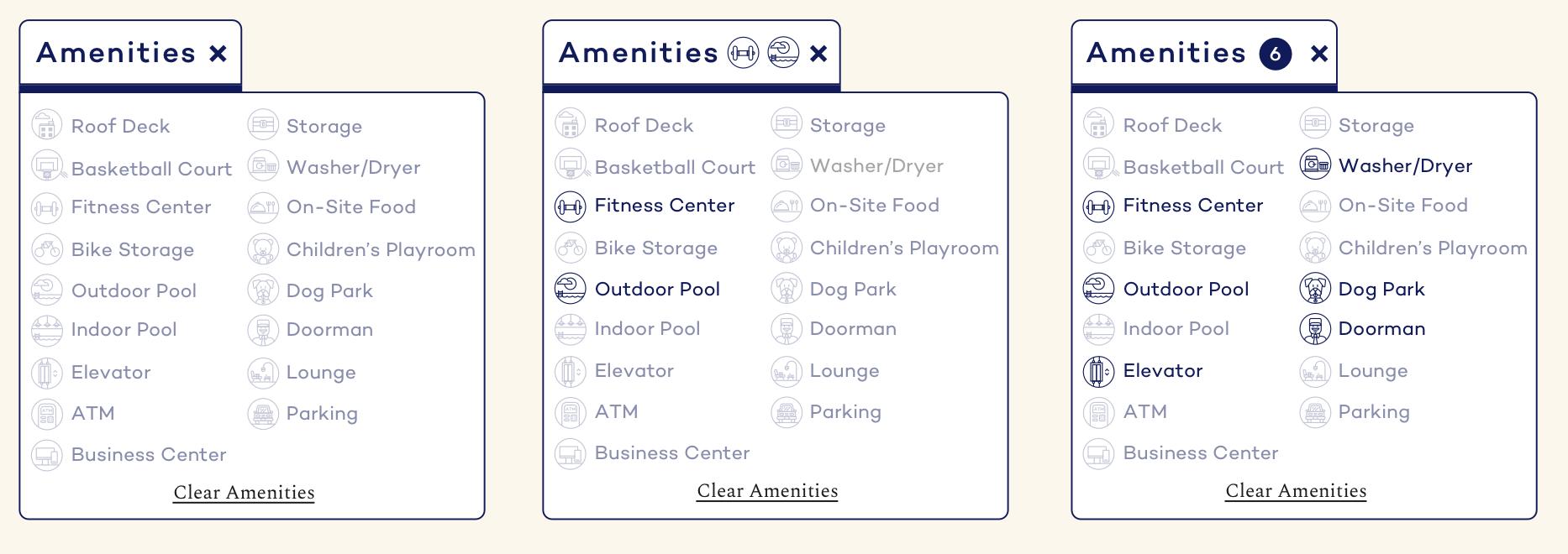

It was also important to design both an empty state if the filters turned up no units and an error state in case anything went wrong with the filtering system.

Since we were making deals with landlords prior to units being ready and photographed, I designed a photo template for apartments under renovation that are available to be pre-booked.
Once you click on a unit, you're taken to its unit page where you can get a full size gallery, more information on the amenities and policies in-place and a booking block, where users can see when the unit is available and book based on its availability.