Stayawhile Internal Dashboard
The operations team was managing all our units and customer interactions through an increasingly complex and bloated set of Excel spreadsheets. If we were to scale this operation, it was obvious we needed to develop an internal platform for the following use cases:
- Setting up a new or unfurnished apartment.
- Managing apartment bookings.
- Keeping track of all furniture in our units along with their vendor information and use status.
- A full archive of all members that booked that specific unit, with links to their customer profiles.
- Voting
- Membership Club
- Credit Scoring
At that point we were focused on scaling, so we needed a system where we could keep track of what steps had been completed in the process of setting up a new unit. This includes buying and installing the furniture, setting up the WiFi, cable and smart home technology, keeping track of all incoming and outgoing payments to our landlords and utility providers, making sure the kitchen and bathroom toiletries were properly stocked along with bedding appliances and finally keeping track of any damages or obstacles that may have occured in the setup process.
This requires an enormous amount of work from several key people, both in the office and on the field, so responsiveness was key. In seeing the master list of properties and furniture, a table view is the most appropriate way to display this content. The problem with tables is that they're not responsive, so I designed and coded a tabular UI system that on larger devices displays as a table but condenses into a card on smaller devices, the result being totally responsive tables.

To set up these units, tasks need to be completed. Collaborating with the team, I identified the three core task interactions:
- Free Entry: The task requires some sort of string to be manually added to the database.
- File Upload: The task requires the upload of some form of external file, usually a PDF form or document.
- Mark as Complete: The task requires the user to do something physical in the actual unit, such as moving a couch or calling the landlord, and will only be marked as complete if the task has been done. Likewise, if there's some sort of obstacle preventing the completion of this task, the user can select 'Issue' from a dropdown menu and write what happened in a textbox.
For the actual process of setting up units, tasks don't need to be completed in some chronological order, but some tasks require another task to be completed. The solution was nested tasking, similar to nested comment threads in platforms like Reddit. Tasks also have a designated person-in-charge, an ETA for completion and a color key noting how critical it is to complete.

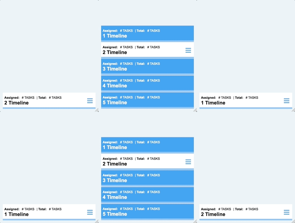
In setting up a unit, there are multiple roadmaps with different corresponding teams. In Excel, multiple spreadsheets are separated by a fixed set of tabs at the bottom of a document. I borrowed this UI convention for the dashboard due to the team's familiarity with Excel, but Excel's approach lacks the responsiveness we need. My solution to build out a fixed bottom 'dropup' menu.


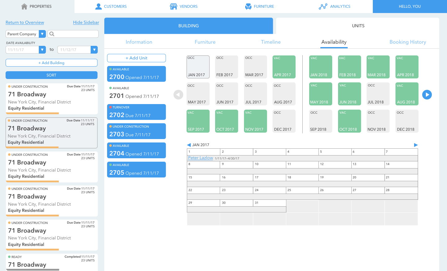
Properties are also divided between Building and Units tabs. The Building tab pertains to all information related to the building itself, including the name, location, amenities, policies, etc. It also hosts a master list of all availability and a calendar view for occupancy.


The Units tab has a sidebar with individual units within that building. It also shows information exclusive to that unit, a list of the furniture within, its availability, timeline and booking history.


